Our product challenges conventions in the contrast between the video and ancillary products. Usually the style will match, but ours contrast in a way that intentionally confuses the viewer, throwing them off guard and potentially increasing the emotional impact of the video. We used several conventions used previously in similar products, namely the Point-of-View style of shooting (seen in Gomez's 2006 music video for "See The World") and the gritty, dark atmosphere and themes, seen is many indie productions. I feel we developed this style to a point where it becomes darker and more gloomy than most videos of similar style.
2) How effective is the combination of your main product and ancillary texts?
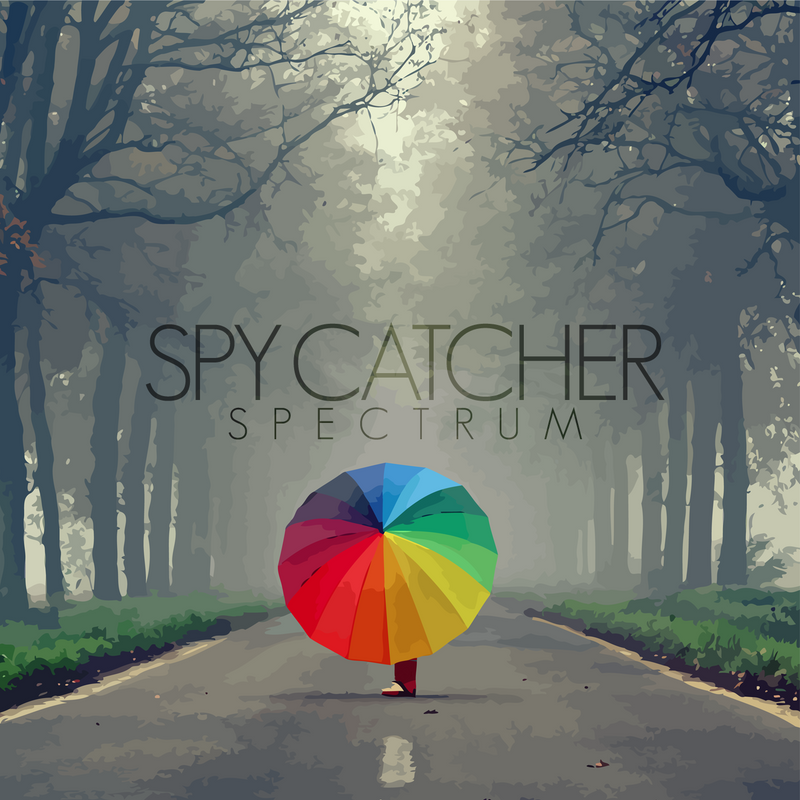
Our music video and ancillary texts/products (Album Cover, Tour Poster) work well together. A theme of mystery and enigmas is prominent throughout both:
- In the video, we never see the person's face as it is shot point-of-view. This garners an atmosphere of mystery as it keeps you guessing as to who the person might be and what their story is. He/she is an enigma.
- Similarly, the Album cover/tour poster's main image of a person behind a colourful umbrella promotes the theme of mystery. On these and in the video it is left up to the viewer to interpret this theme as they see fit, whether it be creating a full back-story for this person, or as simple as trying to guess their gender.
A weakness in the comparison between our main product and ancillaries is that the shooting style won't necessarily match for some people. The video is dark and gritty, intentionally low-quality in parts whereas the Album cover and Tour poster are clean and professional-looking. An explanation for this, is that the music video represents only one song, which in itself has an indie, low-budget, gritty feel. The album cover and tour poster represents the whole album, which has an unknown style.

3) What have you learned from your audience feedback?
The main thing we learned from our audience feedback was that we needed to make the themes and plot of the video more clear. There is something to be said for letting an audience interpret something for themselves and take from it what they can but the response to our video showed we needed to give more clues as to what is going on, without making it obvious, which was our aim all along.
4) How did you use media technologies in the construction and research, planning and evaluation stages?
Research/Planning
Our group used various video sharing websites to research examples of music videos and their themes and ideas to use in our own video. Sites such as YouTube and Google Video were useful for this purpose.
We also used the Art/Design social networking website deviantart.com to find work we could potentially use for the artwork (our best option given the ease of contacting the artists and getting permission to use the images), and Google images to find examples of existing album art to take inspiration from.
Construction
We used a handheld camera without a tripod to get the best possible results in relation to our video's themes and feel. The shaky effect added to the low-budget and gritty feel. We edited in Adobe Premiere Elements, and the artwork was constructed almost entirely in Adobe Photoshop CS5, making use of vectormagic.com and a very small amount of Adobe Illustrator CS5 to import the vectorised images (more information on this in previous posts).
Evaluation

We used wordle.com to put together the image seen here, made up of the most popular responses to our video.


